
One wall does the work
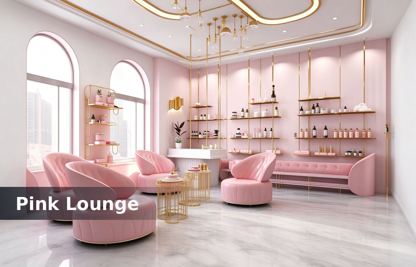
Famous nail salons are not famous for square metres. They are known for one photograph: an arch of polish, a pink banquette, a wall of colour under light, and that single frame travels further than any advert. The same rule holds for a street salon and a mall unit, with the arch mattering more in a small room.
Build the one frame first. A salon with one strong corner and a plain room reads as designed, and a salon with five effects in one room reads as busy and gets no photograph at all. We keep the alternative on the same quotation, so the buyer compares a number instead of a preference. That number belongs on the drawing, because a proportion agreed verbally rarely survives the first photo.
The colour wall is the signature
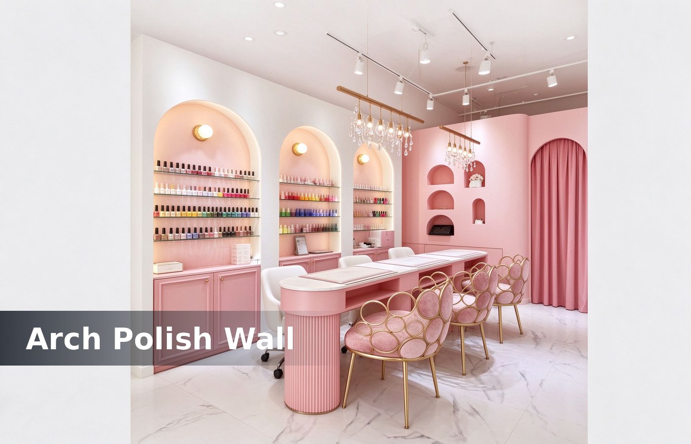
A polish wall at 1.8 m wide and 2.2 m high holds about 480 bottles on ten shelves at 180 mm pitch. That wall is the signature, and every memorable salon we have built has one. Most of these mistakes appear on opening day, which is exactly when the first client posts. Mark it on the drawing sheet too, so whoever fits the second room later has the reference.
Backlight the wall at 400 lux. A wall lit only from above leaves the lower rows dark, and a client browsing a dark row asks staff for a colour the shop glass showcases. One phone photo of a sample corner settles the question faster than a week of drawing revisions. None of that shows in a render, which is why we mock the colour wall at full size before cutting.
Arches, not rectangles
An arch reads warmer than a rectangle on a phone. Set the arch at 900 mm wide and 2100 mm high, with the polish shelf inside it, and the opening frames the colour. Clients who settle it at design stage pay nothing extra, and clients who settle it after opening pay for a rebuild. The same rule holds for a street salon and a mall unit, with the arch mattering more in a small room.
Repeat one arch three times along a run and stop. A run of six arches looks like a corridor, and a run of three looks like a display cases. We keep the alternative on the same quotation, so the buyer compares a number instead of a preference. That number belongs on the drawing, because a proportion agreed verbally rarely survives the first photo.
Build the arch in MDF with a laminate face, not plasterboard. A plasterboard arch cracks at the curve within a year, and a laminate arch takes a wipe from a polish spill. Most of these mistakes appear on opening day, which is exactly when the first client posts. Mark it on the drawing sheet too, so whoever fits the second room later has the reference.
Seating that photographs
A salon seat is half the image. A curved banquette in a warm fabric photographs better than four separate chairs, and it seats five in the same 3 m run. One phone photo of a sample corner settles the question faster than a week of drawing revisions. None of that shows in a render, which is why we mock the colour wall at full size before cutting.
Keep the seat at 450 mm and the table at 750 mm. A lower seat makes the client reach up for every hand, and a higher table hides the work from the kiosk design. Clients who settle it at design stage pay nothing extra, and clients who settle it after opening pay for a rebuild. The same rule holds for a street salon and a mall unit, with the arch mattering more in a small room.
Light the hands, not the room
Task light at 500 lux per station with a CRI above 90 is what a client sees in the photo. Downlight alone puts the technician shadow over the nail, and the photo shows a shop fixtures. We keep the alternative on the same quotation, so the buyer compares a number instead of a preference. That number belongs on the drawing, because a proportion agreed verbally rarely survives the first photo.
Warm the room to 3000 K and keep the task light at 3500 K. Two temperatures within 400 mm read as a mistake, and a room lit at one temperature reads as one brand. Most of these mistakes appear on opening day, which is exactly when the first client posts. Mark it on the drawing sheet too, so whoever fits the second room later has the reference.
The reception moment
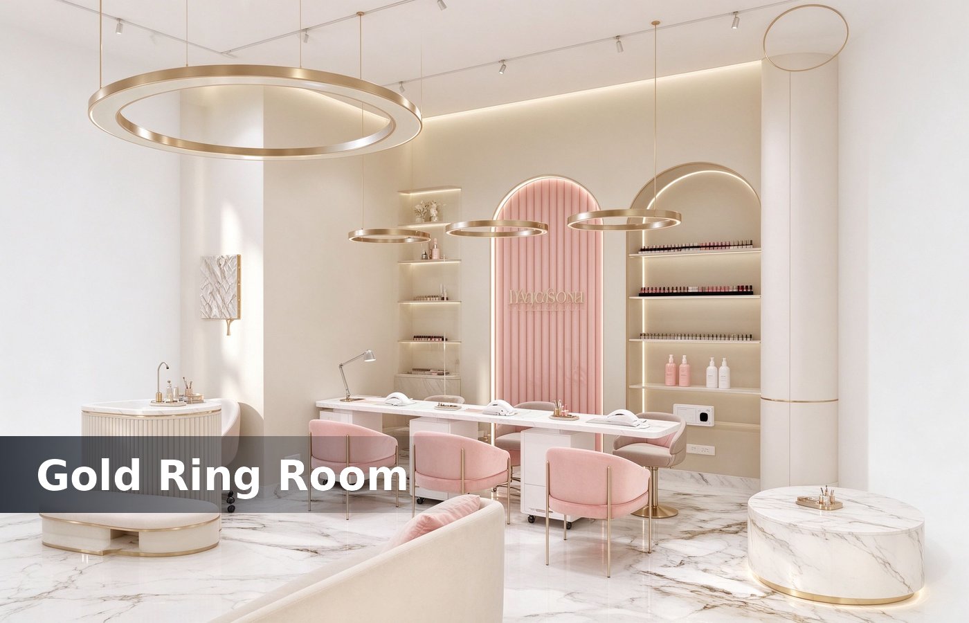
Reception takes the second photograph. A 1.2 m counter at 1000 mm with a marble top and one flower reads expensive, and a counter crowded with product reads like a stock room. One phone photo of a sample corner settles the question faster than a week of drawing revisions. None of that shows in a render, which is why we mock the colour wall at full size before cutting.
Put the till on the staff side and keep 600 mm clear on the client side. A counter with a card terminal facing the door looks like a payment point and cash counters. Clients who settle it at design stage pay nothing extra, and clients who settle it after opening pay for a rebuild. The same rule holds for a street salon and a mall unit, with the arch mattering more in a small room.
Keep the waiting bench at 450 mm and 1.6 m long. A client waiting for a walk-in sits for eleven minutes on average, and a bench that fits two turns that wait into a stand at the door. We keep the alternative on the same quotation, so the buyer compares a number instead of a preference. That number belongs on the drawing, because a proportion agreed verbally rarely survives the first photo.
Three patterns that repeat
Three layouts keep turning up in the salons clients send us, and each one suits a different size. Most of these mistakes appear on opening day, which is exactly when the first client posts. Mark it on the drawing sheet too, so whoever fits the second room later has the reference. One phone photo of a sample corner settles the question faster than a week of drawing revisions.
The colour bar runs the polish wall behind a single long table, and it suits 40 to 60 sqm. The twin arch splits the room into two tables with one arch each, and it suits 60 to 80 sqm. The lounge puts a banquette against the window and the wall behind the bar, and it suits 30 to 45 sqm.
Choose one pattern and finish it. A room that mixes a colour bar with a lounge banquette ends with two half rooms, and the photograph retail displays. None of that shows in a render, which is why we mock the colour wall at full size before cutting. Clients who settle it at design stage pay nothing extra, and clients who settle it after opening pay for a rebuild.
Signage and the shelf
A neon sign belongs on the colour wall, not above the door. A sign on the wall sits in frame at 1200 mm width, and a sign above the door sits out of frame in every client photo. The same rule holds for a street salon and a mall unit, with the arch mattering more in a small room.
Keep one product shelf near reception for retail. A shelf at 1.2 m with six rows sells take-home colour, and a shelf behind the bar sells nothing because nobody walks behind the bar. We keep the alternative on the same quotation, so the buyer compares a number instead of a preference. That number belongs on the drawing, because a proportion agreed verbally rarely survives the first photo.
Use a 300 mm shelf depth on the retail shelf. A polish bottle is 30 mm wide, and a deeper shelf pushes the front row out of reach and leaves the back row fixture materials. Most of these mistakes appear on opening day, which is exactly when the first client posts. Mark it on the drawing sheet too, so whoever fits the second room later has the reference.
Conclusion
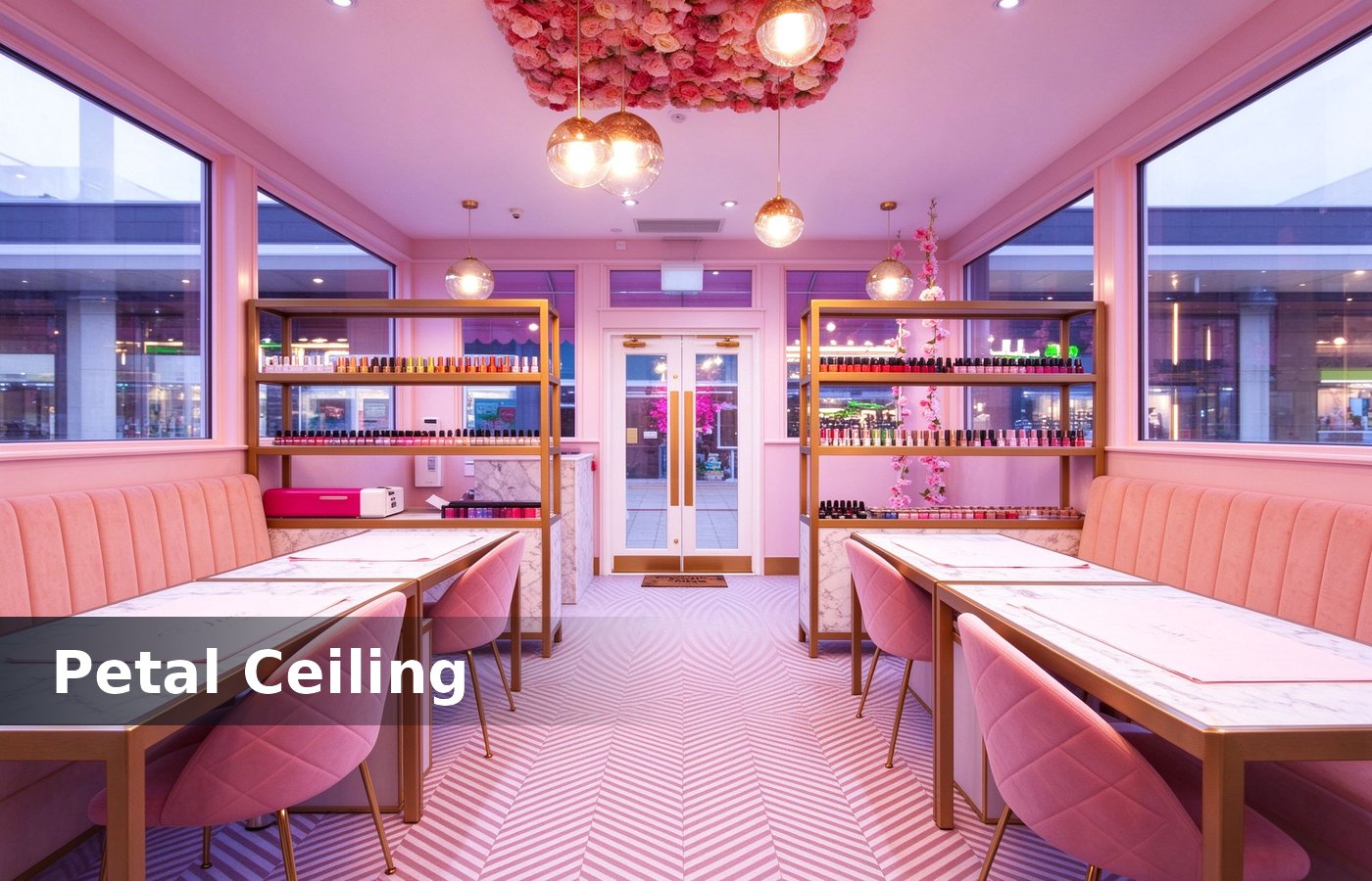
One colour wall, one arch repeated three times, a curved banquette and 500 lux at the hands. Those four items make the photograph that makes the salon known. One phone photo of a sample corner settles the question faster than a week of drawing revisions. None of that shows in a render, which is why we mock the colour wall at full size before cutting.
Fame in this trade is a picture, not a budget. A 45 sqm room with one strong corner outranks a 120 sqm room with five, because the first one gets posted. Clients who settle it at design stage pay nothing extra, and clients who settle it after opening pay for a rebuild. The same rule holds for a street salon and a mall unit, with the arch mattering more in a small room.
Finish the glass and the trim before the opening shoot. A chip on a table edge shows at 1400 mm in every close-up, and a repolish after the shoot costs a counters and towers. We keep the alternative on the same quotation, so the buyer compares a number instead of a preference. That number belongs on the drawing, because a proportion agreed verbally rarely survives the first photo.