
Project Description
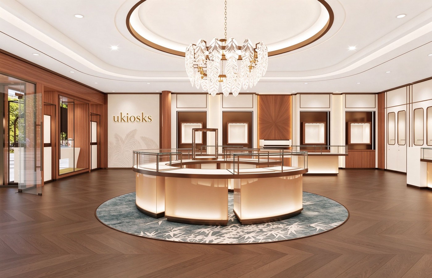
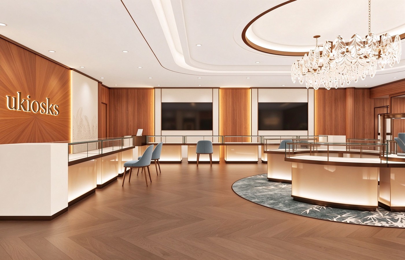
This jewellery store design shows one brand carried through every fixture in the room. The five renders below cover the entrance, the wall bays, the perimeter counter run, the round island and a close view of a single case. All display decks are shown empty on purpose, so the shape, depth and lighting of each fixture stay easy to read.
Overall Design Direction
The room reads as modern classic retail, warm rather than glossy. Walnut veneer carries most of the wall surface, and cream painted panels break it up in even rhythm. Thin bronze lines frame each panel and close every edge. Nothing here is white lacquer and nothing is chrome, so the store sits closer to a gallery than to a mall unit.
The plan runs as a loop. A visitor enters on the left, passes the reception desk, follows the perimeter counters and ends at the round island in the middle. Our industry page shows the same loop logic applied to other sectors. For a brief like this, settle retail store display planning before choosing any fixture.
Walnut and Cream Palette
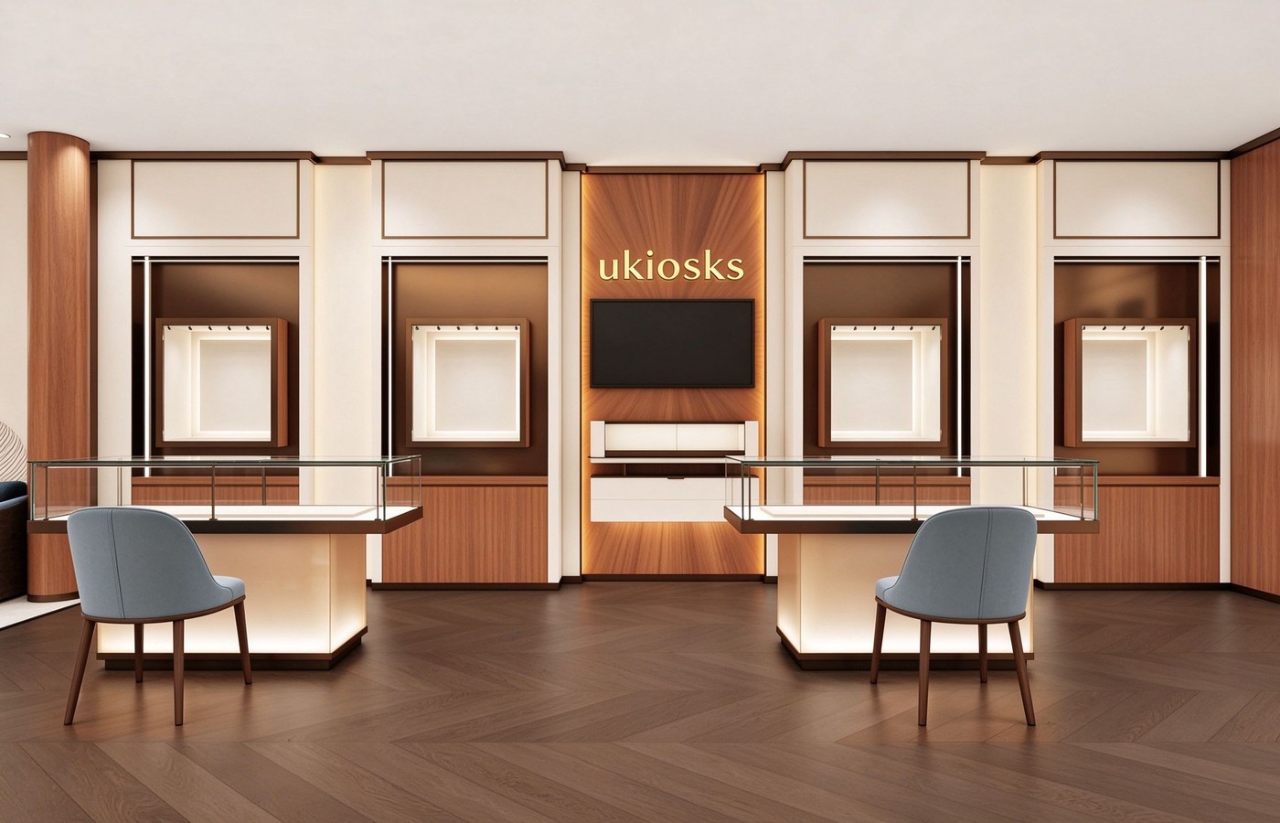
Walnut appears in two cuts. The perimeter panels use a straight vertical grain, while the central back panel uses a fan pattern cut from the same board. Cream panels sit between them in a matte finish that reflects almost nothing. The joint between the two materials is a 12 mm bronze reveal that runs the full height.
That reveal does two jobs. It hides the panel joints, and it carries the eye around the room without any extra trim. The palette repeats on the counters, where the bronze band under the glass matches the wall reveal exactly. Store showcase pages show the same material pairing on other retail types.
Wall Display Bays
The back wall holds four display niches, two on each side of the centre panel. Each niche is a recessed box with a glass front and a lit back, so a single piece reads against a warm gradient. The niches are square, around 600 mm across, and they sit at standing eye height.
Because the niches are recessed, the wall stays flat and the floor stays clear under them. This approach suits slim and small products, and it costs less than a freestanding display cabinet of the same width. A black screen fills the centre panel between the niches and stays blank in this scheme.
Round Island Counter
The island is built as a ring of curved counters around an open centre. Each segment carries a glass hood on a bronze base band, and the body below is a translucent panel lit from the plinth. The ring sits on a round patterned rug, which marks the slow zone in the middle of the floor.
Curved glass is the hardest part of this build. Segments are cut on a CNC line, then assembled with thin metal posts between them. A rectangular display counter costs less, but the ring lets staff stand inside and serve from any side of the island. The bronze band hides the joint where the curve meets a straight return.
Perimeter Glass Counters
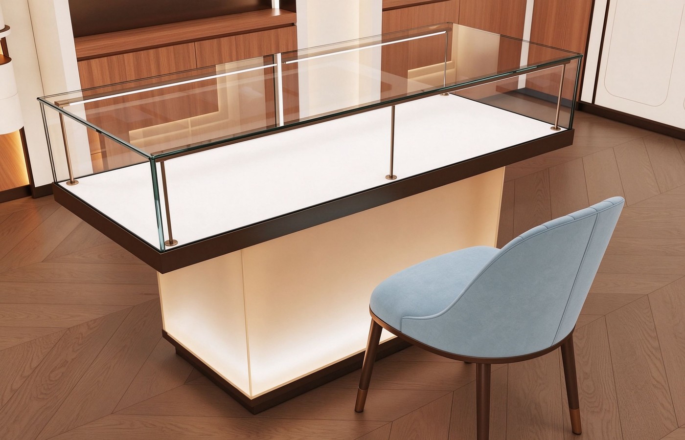
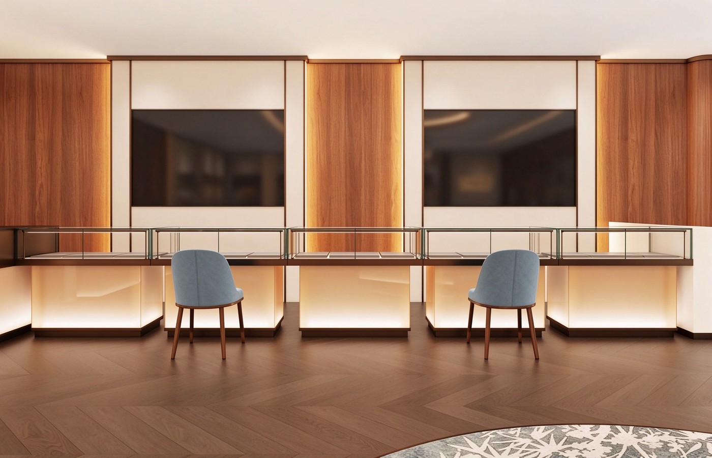
The perimeter run is a chain of rectangular cases, each with a glass hood, a white deck and a lit body. Cases are separated by narrow returns, so the run reads as one line while staying serviceable unit by unit. Each hood carries two or three vertical glass dividers inside.
Deck height sits near 950 mm, which suits a seated customer. The lit body throws light upward through the deck and adds a soft glow at floor level. Compare display table and display stand options when a full glass case is more than the stock needs. Two customers can stand at one case without leaning over each other.
Reception Desk and Entrance
The reception desk is a plain white block with a bronze base band, set against the walnut feature wall. Above it, the brand sign is backlit through a fan-cut walnut panel. The desk carries no glass and no display, so it reads as a service point rather than a selling point.
The entrance uses full height glass doors on a slim frame. From the doorway a visitor sees the island ring first, then the counter run behind it. That order is deliberate, because the first ten metres of a store carry most of the first impression a customer keeps. Door frames are kept dark, so the glass edge disappears at eye level.
Lighting Layers
Three layers carry the light. A cove ring runs inside the round ceiling recess, recessed spots wash the wall panels, and the fixtures add their own light through lit bodies and hood strips. None of the three layers is strong on its own, and together they leave no dark corner in the room.
The chandelier is the only decorative piece, a tiered crystal form on a chain over the island. Keep the colour temperature near 3000 K across all three layers, or the walnut turns grey under the light. Fixture light should always match the wall wash temperature. Its crystal arms catch the cove light and scatter small highlights across the ceiling.
Seating and Customer Flow
The chairs are pale blue upholstered shells on tapered wood legs. Two sit at the wall bays and two at the island. That blue is the only cool note in the room, and it repeats in the rug pattern. Seats are placed so a customer faces the case, never the open aisle.
Flow stays wide. A 1.6 m clear walkway runs between the island and the counters, so two visitors never block each other. Staff work on the inside of the ring, out of the customer path. This layout suits a store of roughly 200 to 400 square metres. The rug edge marks the boundary, so nobody drifts into the service zone.
Empty Shelves and Fast Restyle
Every case in these renders is empty on purpose. An empty deck shows the structure, the deck depth and the light spread without stock hiding the details. It also shows how little product is needed when the fixtures themselves carry the display. A buyer can judge the deck height and the glass height in one look.
A visual team can restyle a store like this in under an hour. Swap the deck pads, change the niche backdrop, move the chairs, and the room reads new. A slatwall display wall can be added later if the stock range grows beyond the counters. The counter modules keep their wiring, so no electrician is needed for a reset.
Build Specification
Typical build: 18 mm plywood bodies with walnut veneer and matte cream laminate. Glass hoods use 6 mm tempered panels with polished edges, and base bands are 1.5 mm bronze anodised aluminium. Lit bodies run 12 V LED strip on a dimmable driver, set back from the deck edge. Bodies are sealed on every face before the veneer goes on.
The floor is engineered walnut laid in chevron pattern, and the ceiling is plasterboard with one recessed ring. Counters are modular, so a single bay can be replaced without touching the whole run. Send a plan to our contact page for a costed layout and a lead time. Underlay is levelled first, because chevron joints show every dip.
Warm materials make a compact store feel larger, and a ring island pulls visitors into the middle of the floor. Recessed niches keep the walls quiet, lit counter bodies replace heavy spot lighting, and empty decks prove the fixtures can carry a restyle. Pair this scheme with jewelry displays or watch and jewellery fixtures when the stock mix changes. ukiosks builds these counters in any radius, height and finish, and we quote each case from a plan.