
Color decides the first look
Jewelry cabinet color decides what a shopper sees before the stock. A cabinet two shades warmer than the wall reads as a display, and a cabinet in the wall tone reads as furniture, and the second one sells less at the same rent. The same rule holds for a fixed kiosk and for a demountable one, with fixing points mattering more on the demountable build.
Four finishes carry most of our orders: white with gold edge, warm white with brushed brass, dark walnut with black steel, and full matte black. Each one suits a different price band, and each one photographs differently under mall light. We keep the alternative on the same quotation, so the buyer compares a number instead of a preference. That figure belongs on the drawing, because a colour agreed verbally rarely survives a change of lamp.
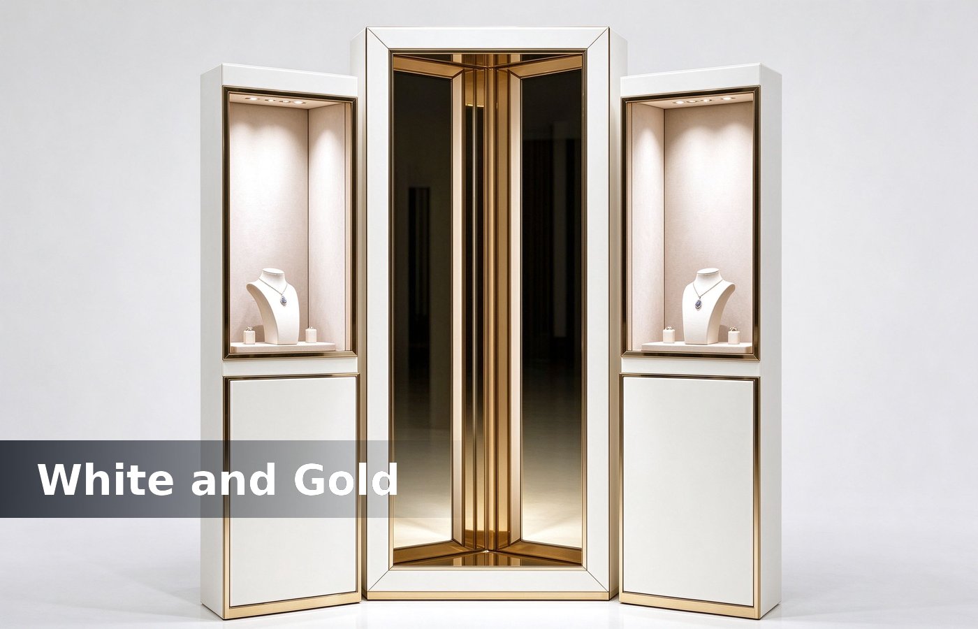
White and gold: the safe seller
White with a gold edge is the default for a mid market jewelry counter. White lifts the stock and gold gives the edge a line, so the cabinet reads expensive without needing a big fascia jewelry kiosk. Most of these mismatches appear at handover, which is exactly when a mall lease starts running. Mark it on the crate label too, so whoever repairs it later has the reference without hunting a folder.
The risk is matching. A cool white cabinet beside a warm white wall looks blue in photos, so specify both under the same light temperature. We send a panel chip with the sample, and the client approves the pair, not the cabinet alone. Two minutes with a panel settles the question faster than an hour of specification reading.
Gold tone matters too. Yellow gold edge suits yellow stock, and a pale champagne edge suits white gold and platinum, because a yellow line beside white metal makes glass showcases and cheap. None of that shows in a render, which is why we check it on a sample panel before the run is released. Clients who settle it at design stage pay nothing extra, and clients who settle it after opening pay for a repaint.
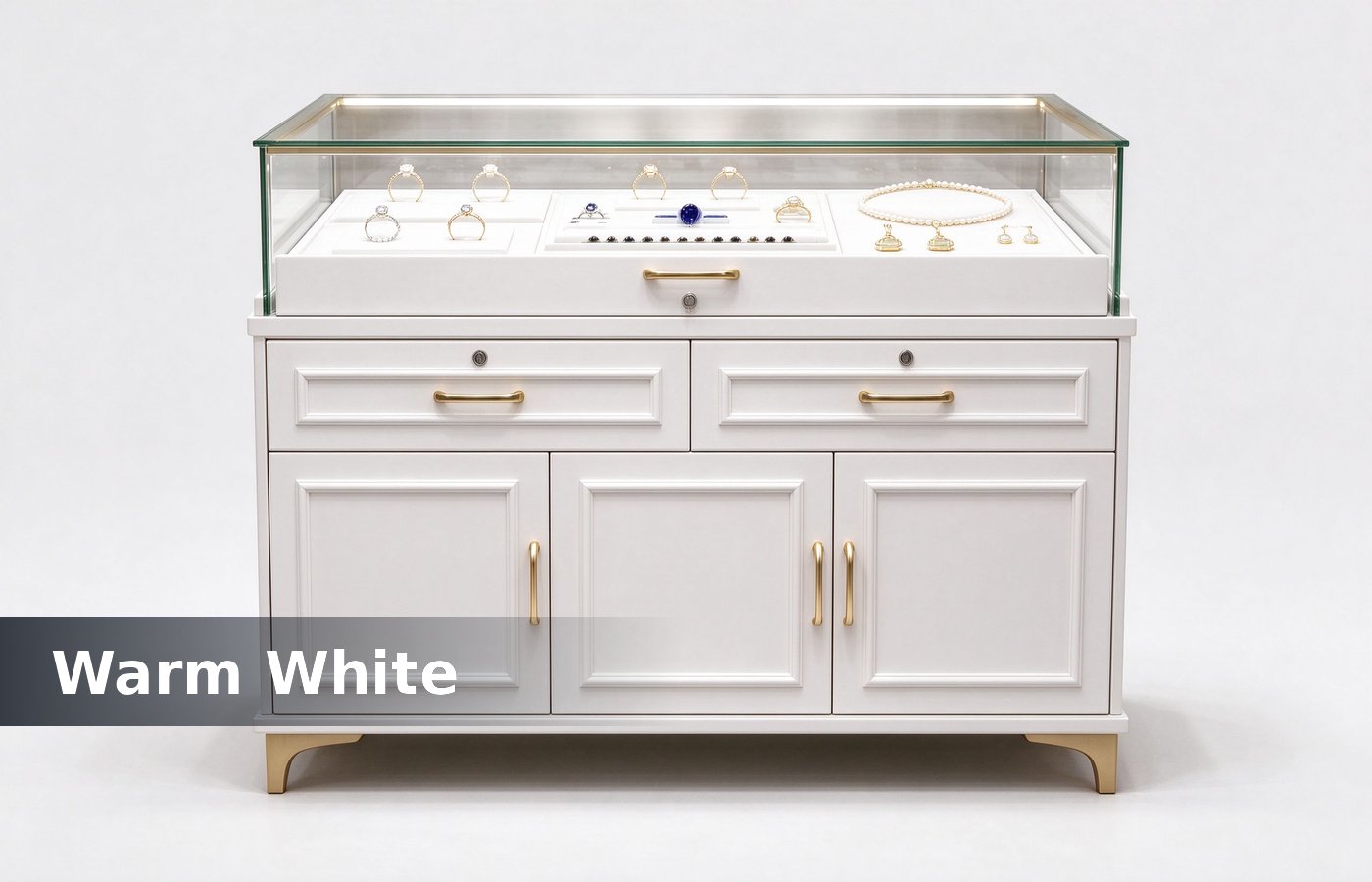
Warm white and brass
Warm white with brushed brass is the finish for a boutique that sells design pieces rather than volume. Brass reads softer than gold, hides fingerprints better and ages into a patina that clients read as craft rather than wear. The same rule holds for a fixed kiosk and for a demountable one, with fixing points mattering more on the demountable build.
Brushed brass also photographs well on a phone, which matters because most of a small brand traffic arrives through social posts taken in store. Polished brass throws a bright line into the lens and blows out the stock behind it. We keep the alternative on the same quotation, so the buyer compares a number instead of a preference. That figure belongs on the drawing, because a colour agreed verbally rarely survives a change of lamp.
Walnut and black steel
Dark walnut with black steel suits men s watches, heritage brands and any counter selling weight rather than sparkle. Dark absorbes the surrounding light, so the spot on the tray does all the work and the case disappears. Most of these mismatches appear at handover, which is exactly when a mall lease starts running. Mark it on the crate label too, so whoever repairs it later has the reference without hunting a folder.
Dust shows on dark finishes, and every fingerprint shows on matte black. Budget a wipe twice a day rather than once, or pick a satin lacquer that hides shop fixtures the surface into a mirror. Two minutes with a panel settles the question faster than an hour of specification reading. None of that shows in a render, which is why we check it on a sample panel before the run is released.
Watch stock needs a dark bed rather than a white one. A steel bracelet on white reads grey, and the same bracelet on charcoal reads silver, which is kiosk design for. Clients who settle it at design stage pay nothing extra, and clients who settle it after opening pay for a repaint. The same rule holds for a fixed kiosk and for a demountable one, with fixing points mattering more on the demountable build.
What the finish table says
The table below is the short version we send with a quote. Pick a row, then pick the light temperature that goes with it, because a finish and a lamp are one decision rather than two. We keep the alternative on the same quotation, so the buyer compares a number instead of a preference. That figure belongs on the drawing, because a colour agreed verbally rarely survives a change of lamp.
| Finish | Sells best for | Watch out |
|---|---|---|
| White + gold edge | Mid market, gold stock | Cool white wall clash |
| Warm white + brass | Design pieces, small brand | Patina seen as wear |
| Walnut + black steel | Watches, heritage | Dust on dark tops |
| Matte black all over | Men s line, street brands | Fingerprints on doors |
Light temperature follows color
A white cabinet wants 4000 K light, and a walnut cabinet wants 3000 K. Put 4000 K on walnut and the wood turns grey, put 3000 K on white and the white turns cream, and both mistakes cost nothing to fix retail displays. Most of these mismatches appear at handover, which is exactly when a mall lease starts running.
Order a strip in the same bin for the whole run. Two bins of the same 3000 K read as a yellow case and a white case side by side, and no client accepts that answer after handover. Mark it on the crate label too, so whoever repairs it later has the reference without hunting a folder. Two minutes with a panel settles the question faster than an hour of specification reading.
Sample before the full run
Every finish goes on a 200 by 300 mm panel before the factory cuts the run. The client approves the panel in the store light, and the panel travels with the crates as the reference for touch ups. None of that shows in a render, which is why we check it on a sample panel before the run is released.
A photo approval is cheaper to get and worse to rely on. Phone cameras shift white balance by 400 K between shots, so a client who approves from a photo often rejects the real finish, and counters and towers. Clients who settle it at design stage pay nothing extra, and clients who settle it after opening pay for a repaint.
Conclusion
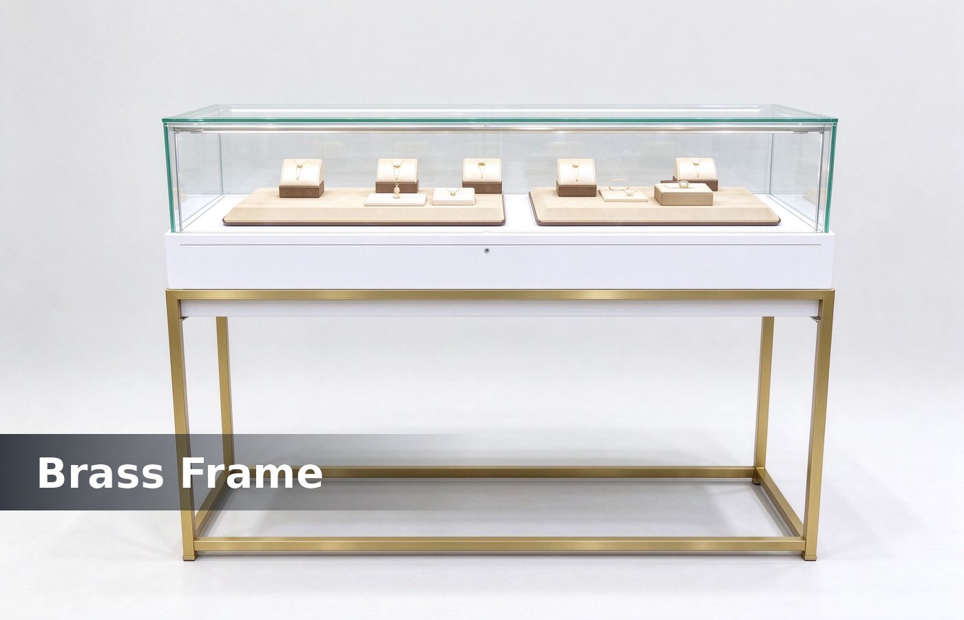
White and gold for volume, warm white and brass for design pieces, walnut and steel for watches, matte black for street lines. Match the light to the finish, approve a panel, and the cabinet sells the stock instead of itself. The same rule holds for a fixed kiosk and for a demountable one, with fixing points mattering more on the demountable build.
We cut finish panels in Shenzhen and ship them with the quote, so the colour question is settled before the drawing is released rather than after the crates arrive. We keep the alternative on the same quotation, so the buyer compares a number instead of a preference. That figure belongs on the drawing, because a colour agreed verbally rarely survives a change of lamp.